


 Richard Perry is a Financial Research and Platform Testing Analyst at BestBrokers.com, specialising in technical analysis, market strategy and the evaluation of trading platforms across forex, stock, crypto, CFD, gold and bitcoin markets.
Technical analysis represents a market evaluation method, which examines market activity statistics such as historical prices and volume. Unlike fundamental analysts, technical analysts (technicians) will not aim to determine the intrinsic value of a given trading instrument. Instead, they will employ price charts and other tools to recognize patterns hinting at future market activity.
With all its exotic tools, technical analysis simply studies market supply and demand to determine the trend (market direction) in the future. It can be applied to any asset class with historical trading data – Foreign Exchange, Stocks, Commodities, Stock Indices, Cryptocurrencies, Bonds, Futures, etc.
There are three key assumptions in technical analysis:
- First, the price discounts everything. Technicians assume that, at any moment, the price of a given trading instrument will reflect everything that has affected or could affect the market, including fundamental factors. In stock market practice, for example, analysts assume that a company’s fundamentals, wider macroeconomic factors as well as market psychology are priced into the stock’s value. Thus, there is no need to consider all these factors separately.
- Second, price movement tends to follow trends. Once a trend has been formed, future price movement is very likely to take the same direction as that of the trend rather than go against the trend.
- Third, history repeats itself, mostly in terms of price movement. This is often attributed to market psychology. Or, we can say that market players consistently react to similar market stimuli over time. Technical analysis utilizes chart patterns to study market movement and to identify trends. Charts illustrate price patterns that can frequently repeat themselves.
Advantages and disadvantages of technical analysis
First of all, technical analysis is very little reliant on fundamental data. For a technician, every piece of news or every macro report has already been priced in by the market one way or another. So, a trader does not necessarily need to wait for monthly or quarterly macroeconomic figures to be released or for some seasonal event to take place.
Another advantage of technical analysis is that it ensures a fast snapshot of data for traders. All the information needed is in a single price chart – price movement, open interest, and volume. By use of the appropriate analytical tools, a technician will be able to determine whether a trade is worth placing or not in a matter of minutes. They will also be able to easily estimate profit targets and risk management parameters.

As for disadvantages, first of all, a technical trader needs to be cautious when establishing their strategy mostly on lagging indicators. It is so, as the latter will reveal past and current events. Yet, those indicators will never reliably project future developments.
Also, since technical analysis tools are accessible to all market participants, one will be competing with both beginners and experts by using the same arsenal. Because many traders employ similar strategies, protective stop placements and support and resistance zones become predictable. Thus, price fluctuations also become predictable. And, if one is to gain the upper hand, they will have to fine-tune their trading tools and trading strategy.
Finally, traders will have to learn to interpret technical analysis tools’ calculations better than other market participants. There is no wrong way to interpret the amassed data, yet, there is always a better way.
In the current guide, we will focus on some key concepts in technical analysis, explore popular technical indicators, and look into commonly observed chart patterns.
The concept of a market trend
When we talk about a trend, we mean the direction in which market prices are moving. A directional trend, formed by increasing or decreasing prices, can be used by a trader to earn a profit by implementing a suitable trend-following strategy.
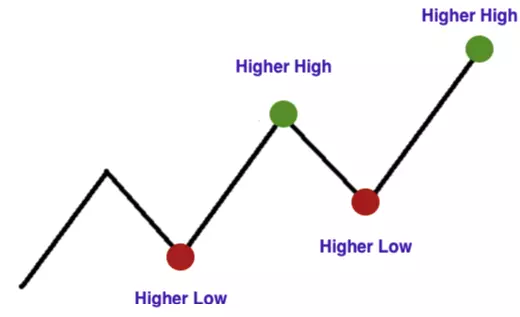
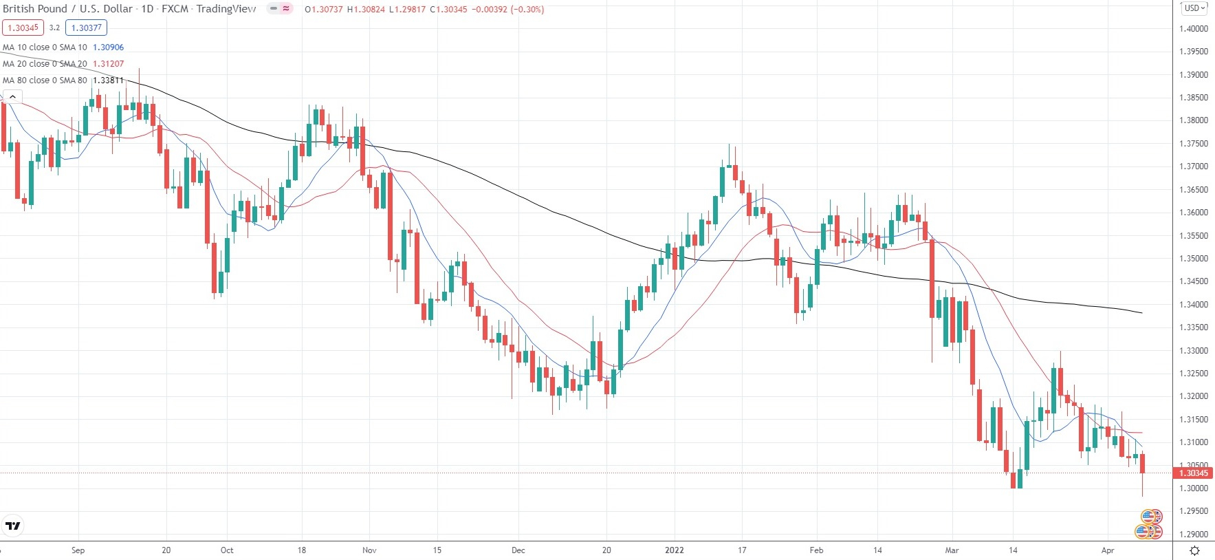
An uptrend (bull trend) can be observed when the price registers higher peaks and higher troughs.
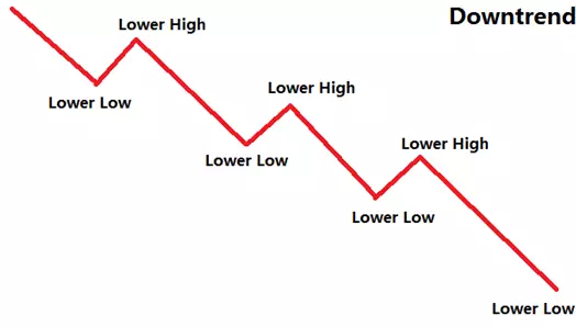
A downtrend (bear trend) can be observed when the price registers lower peaks and lower troughs.
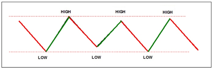
A sideways trend (flat trend or trading range) can be observed, when the price tends to move within a specific range, while not showing considerable movement up or down. In other words, it tends to remain at almost the same level. Such a market configuration can be observed once a bigger trend has come to a temporary halt.
We should note that trend-following methods can be reliable only during bull or bear trends, but they will not offer good results within trading ranges. To take advantage of sideways (flat) trends, most of the traders who rely on technical analysis will use price oscillators.
Also, price action never develops in a continuous, uninterrupted line. At times, there are small countertrend moves within a larger trend that make the underlying trend difficult to identify. We should also note that trends can be of different lengths. In other words, short-term trends form part of long-term trends. From the perspective of a technical analyst, the trend represents a directional price movement that remains in place long enough to be identified and to be taken advantage of.
Some technicians will usually smooth out short-term trends within a trend of interest by using moving averages. This way they can identify longer-term trends.
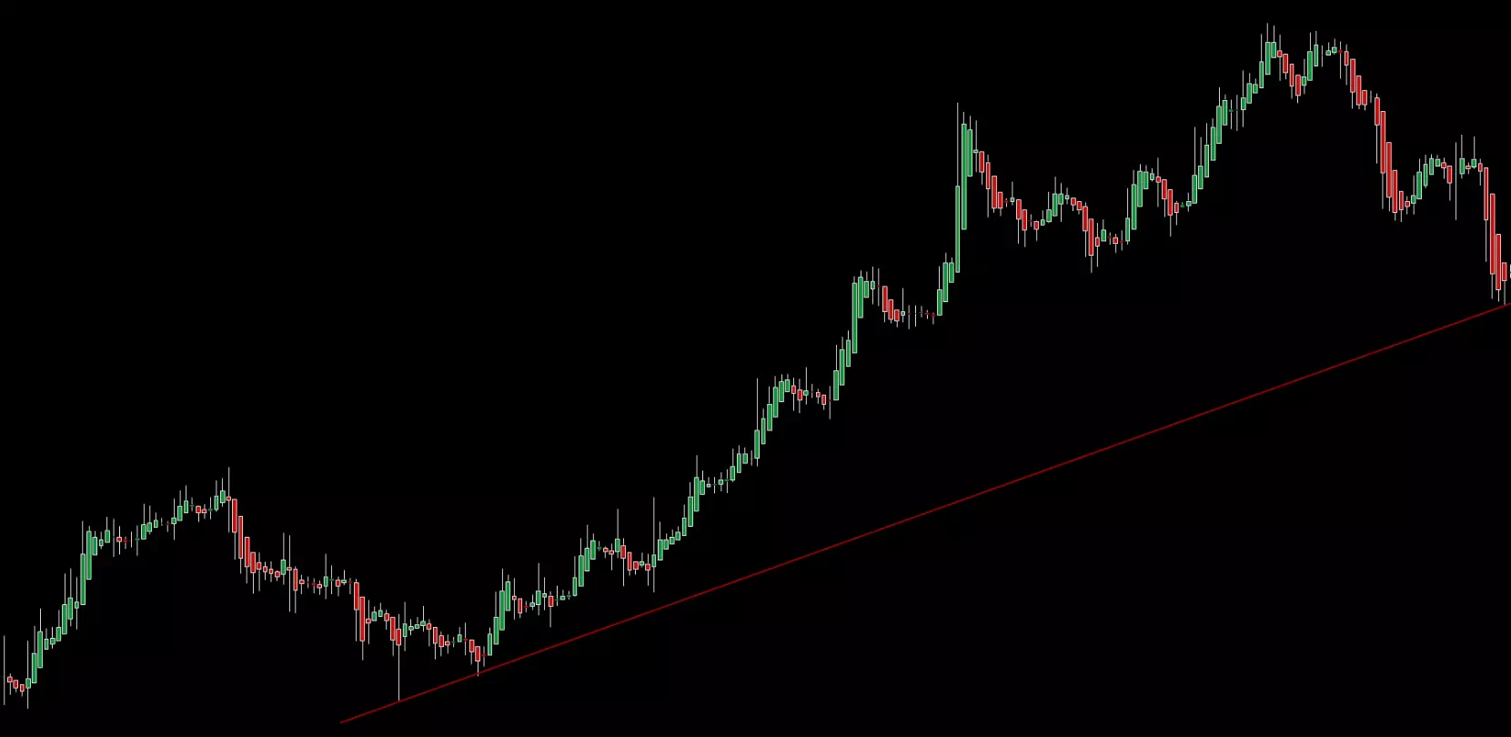
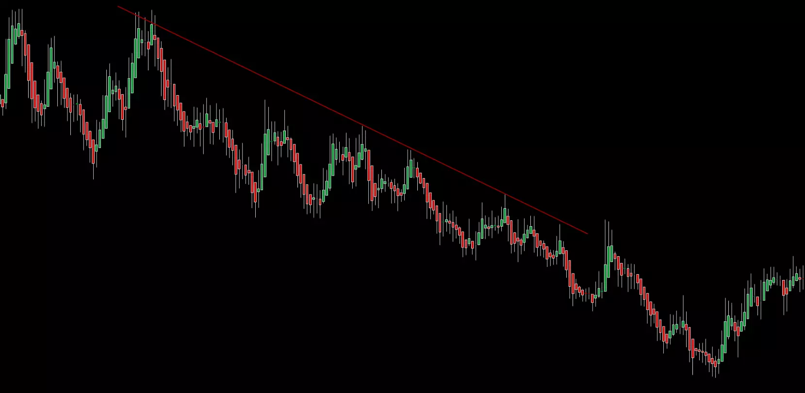
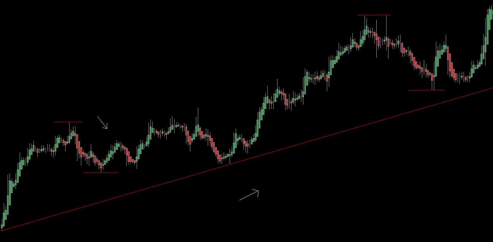
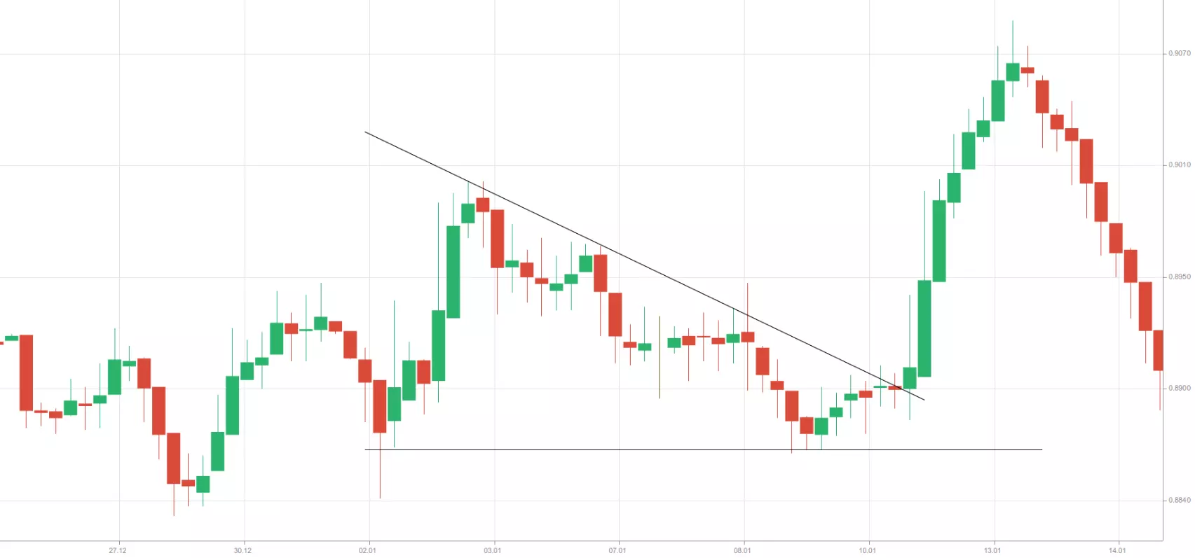
Other traders will closely examine a price chart in search of extreme points (peaks and troughs) that are separated by specific time periods and after that – draw a line between those points. Such a line is known as a trend line. When drawing a line between extreme points – peak to peak and trough to trough, traders can determine price direction and its limits. A trend line, if broken, may indicate that the underlying trend is likely reversing.
To visualize a downtrend, traders will usually draw a trend line above price action. To visualize an uptrend, traders will usually draw a trend line below price action. In a downtrend, a trend line will be determined by price peaks (highs). In an uptrend, a trend line will be determined by price troughs (lows). You will have to find at least two swing highs or two swing lows to draw a trend line. Yet, a valid trend line will usually be determined by at least three peaks or three troughs.
The concept of support and resistance
Price levels of utmost importance based on historical data, which traders use to identify potential points where market movement may stall and reverse, are known as levels of support and resistance.
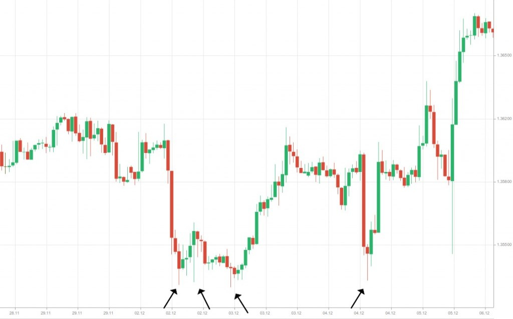
A support level marks the lowest point of a market’s bear trend – usually a single low. At that level, selling faces “buying support”, as bulls enter the market and downward movement loses momentum. A level of support usually serves as a signal for traders to go long or as a price target for their existing short positions.
A resistance level marks the highest point of a market’s bull trend, where bulls are equally matched by bears. Once bears overpower bulls, the price will pull back from the resistance level. That level usually serves as a signal for traders to go short or as a price target for their existing long positions.
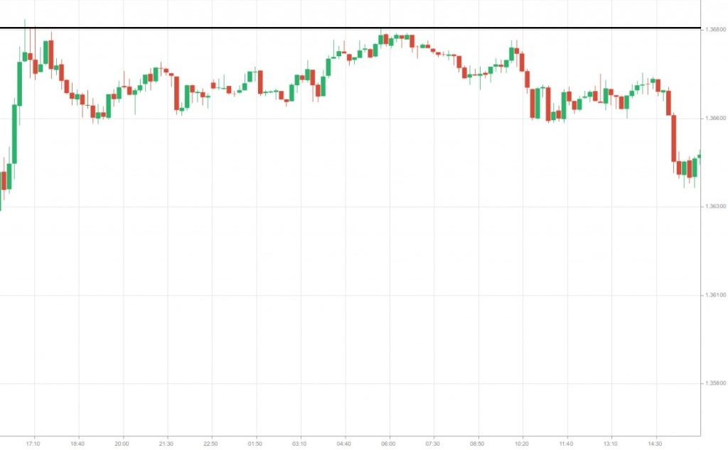
To detect a level of support or resistance, a trader will have to examine the chart for every significant low or high or a particular level where market movement has repeatedly halted and reversed direction.
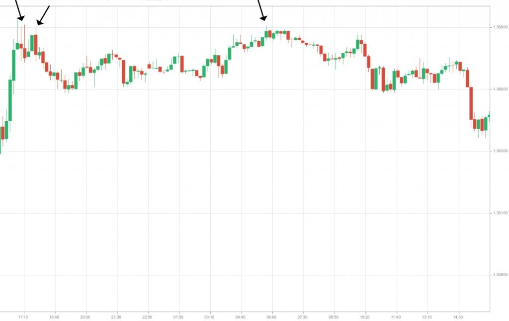
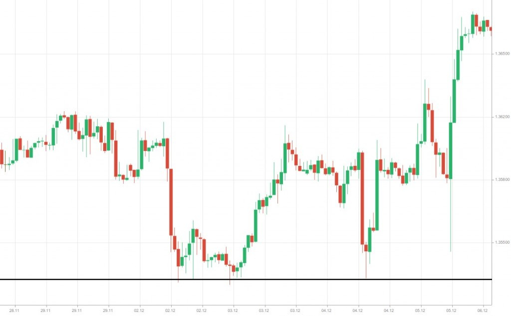
We can see that upward price movement has been halted and a reversal has occurred on several occasions – at obvious levels of resistance.
In the following chart, we can see the opposite situation – downward price movement has been halted and reversed on several occasions – at obvious levels of support.
After we have determined the levels of support and resistance, we will have to visualize them to use them further. We will simply draw a horizontal line through the determined level of resistance or support where price movement is reversed.
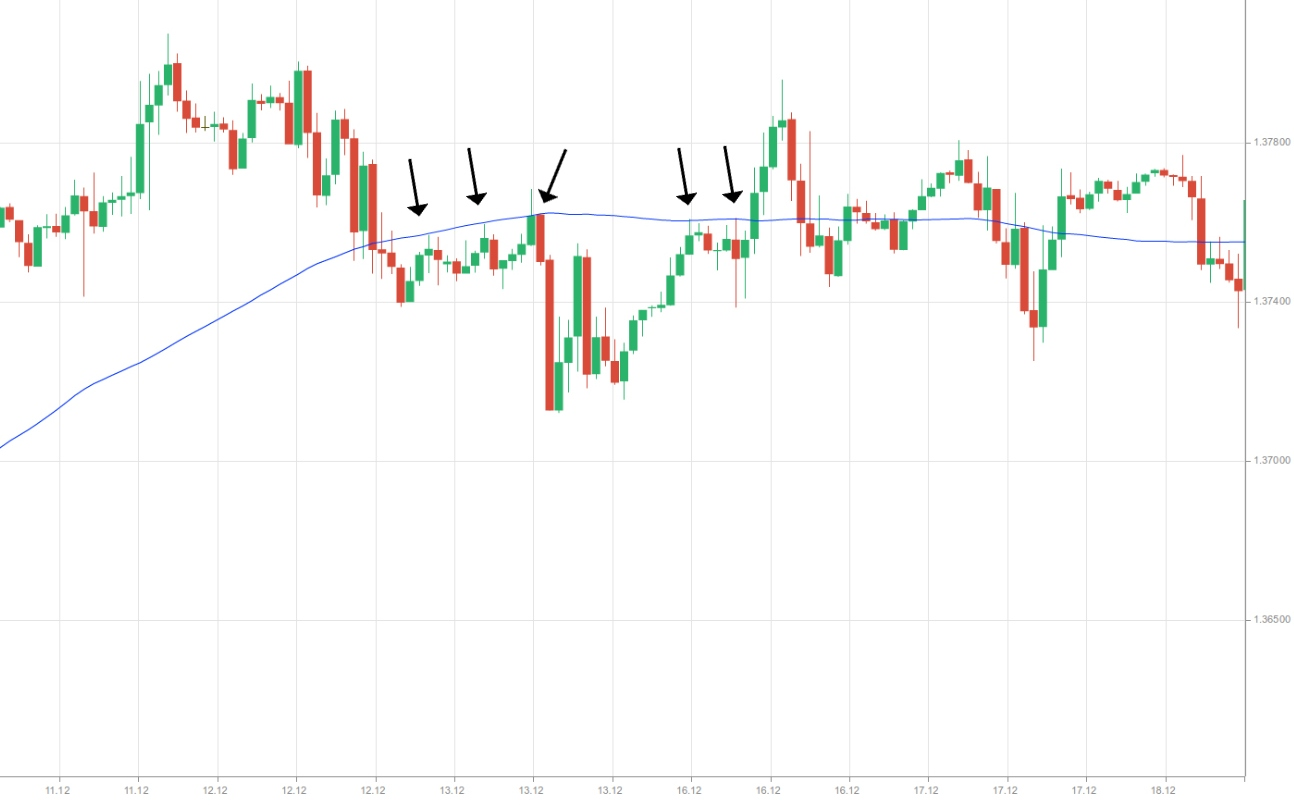
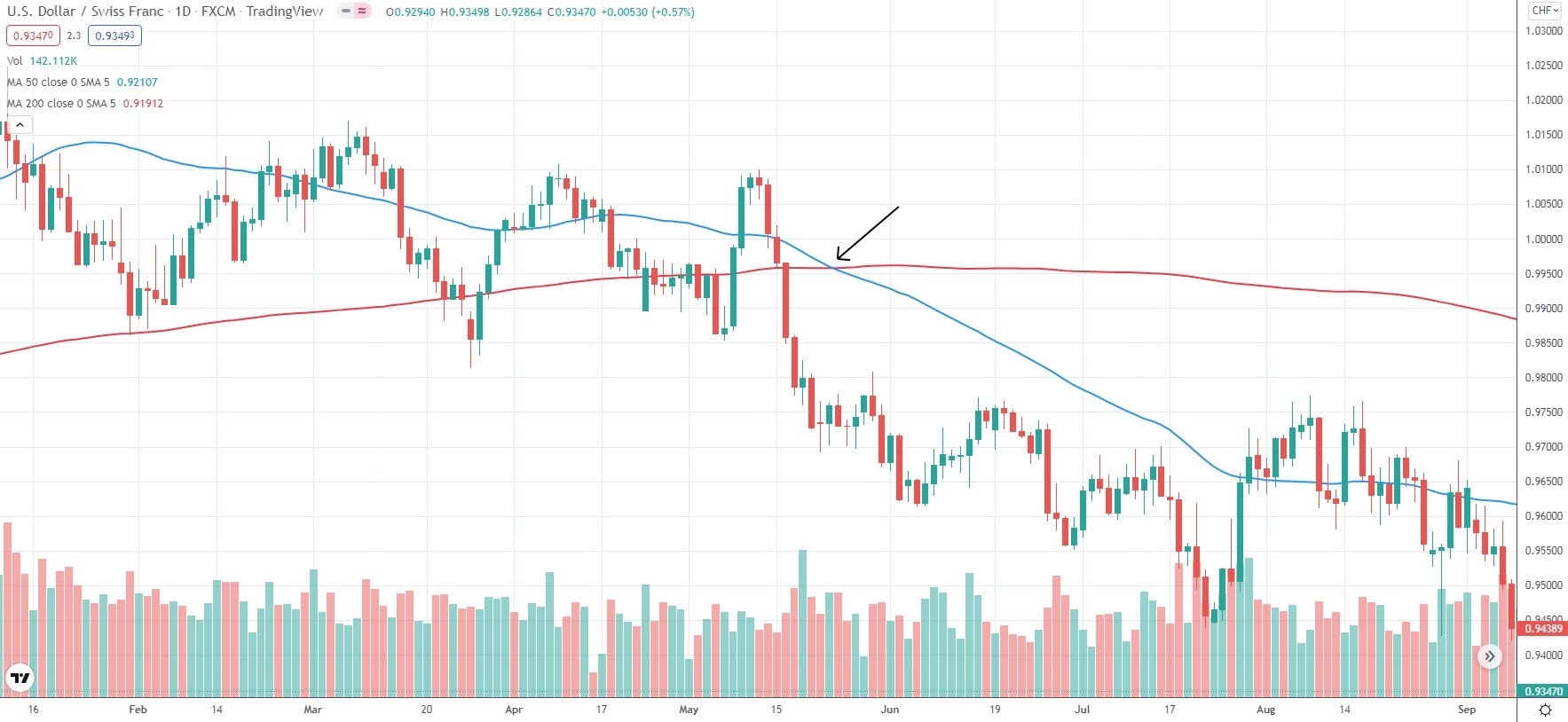
Moving averages can also serve as levels of support and resistance. When prices move in a bear trend and approach the moving average from above, they will usually rebound from it. If, however, prices break below it and continue falling, this may be a strong signal to go short.
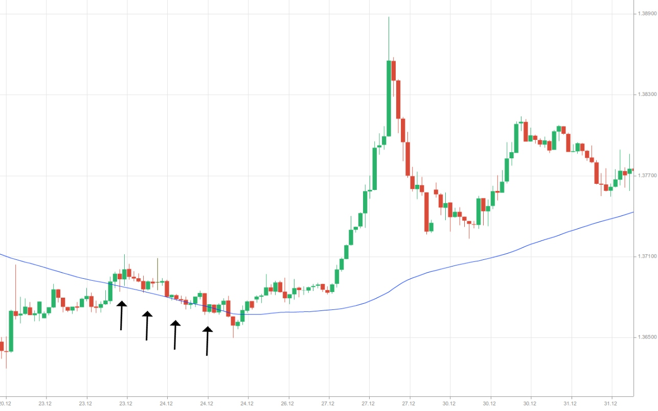
When prices move in a bull trend and approach the moving average from below, they will usually face resistance at its level. If, however, prices break above it and continue surging, this may be a strong signal to go long.
Fibonacci Levels Calculator
| Level | Price |
|---|
| Level | Price |
|---|
Fibonacci levels allow technical analysts to spot resistance and support levels, which may indicate the points where the asset’s price accelerates, pauses, or retracts.
Fibonacci retracement levels allow traders who use technical analysis to predict where price declines may end within a trend. For example, if a stock’s price surges from $100 to $150, those who use a Fibonacci levels calculator may look for a support level somewhere around $138.2 (indicating 61.8% retracement).
Since a large number of technical analysts use Fibonacci levels and choose to act on them, placing multiple orders at these levels may actually cause the price to react, reinforcing the effectiveness of Fibonacci levels.
While retracement levels may help you spot a trend in price pullbacks, extension levels can be useful in predicting how far a price can move after a breakout.
Fibonacci levels are suitable for short-term as well as long-term charts, helping swing traders, day traders, and long-term investors alike.
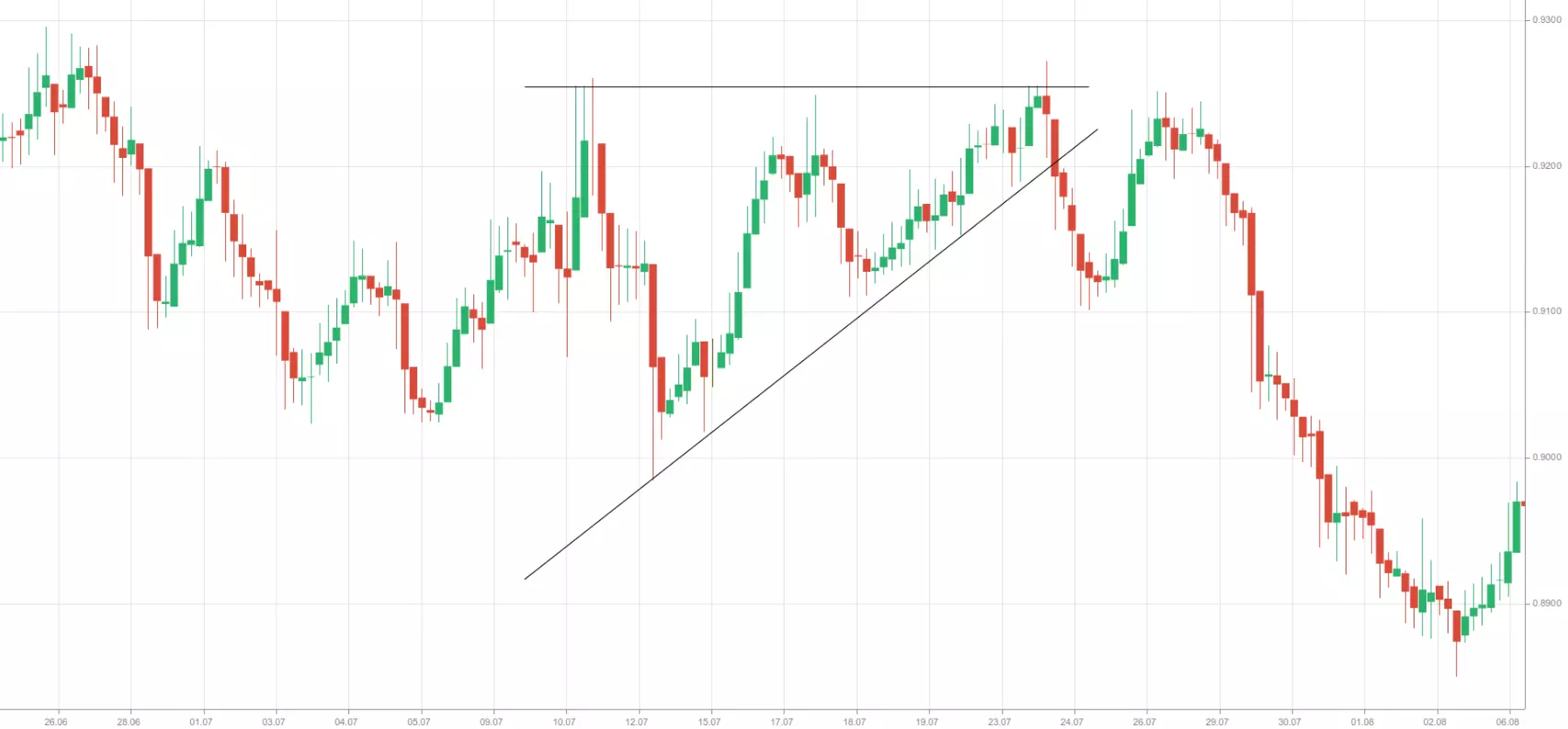
Breakouts
Most frequently, breakouts occur when the price breaks below a previous support level (or zone) and continues heading lower, or when it breaks above a previous resistance level (or zone) and continues heading higher. Breakouts indicate a significant change in demand and supply for the particular trading instrument and that a new trend is likely about to begin.
Breakouts in the direction of the previous trend usually confirm that the trend remains in play. However, breakouts in the opposite direction of the previous trend usually indicate that the trend is likely attempting to reverse and traders should exit their positions and probably reverse them.
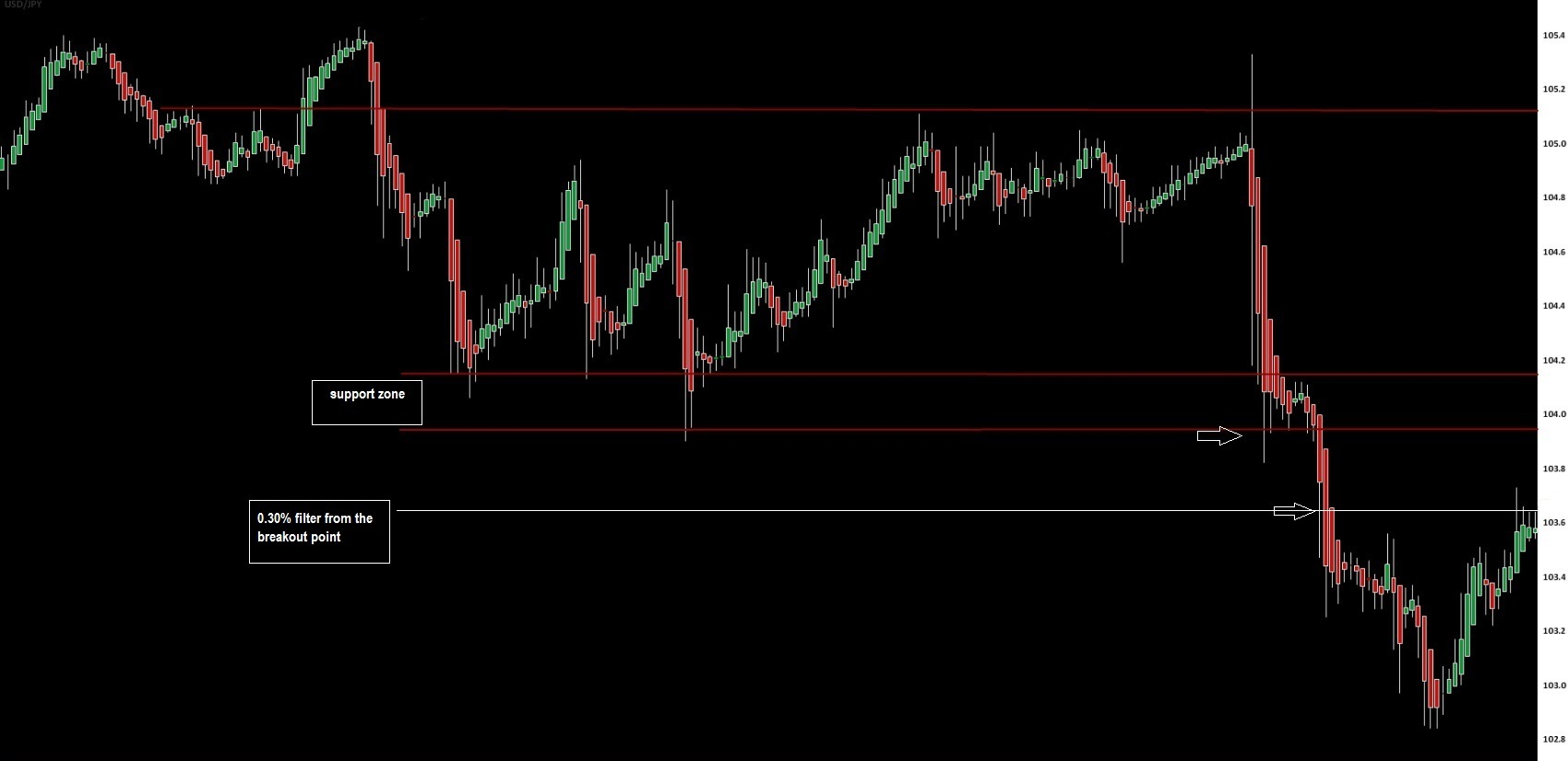
One key circumstance for a breakout includes the penetration of a previous trend line or zone of support or resistance. And, the second key circumstance includes the confirmation that penetration is an actual breakout and not a “fakeout”.
If we take the case with support (resistance) zones, the exact breakout level may not be clear. But usually, the extreme point of the support (resistance) zone can be considered as a breakout level.

If we take the case with trend lines, they can serve as more precise breakout levels. In this case, traders will need confirmation that a trend line has been penetrated. Some traders may prefer to wait for the breakout candle to close. Others may prefer to wait for two or more candles to close below the level of support or above the level of resistance.
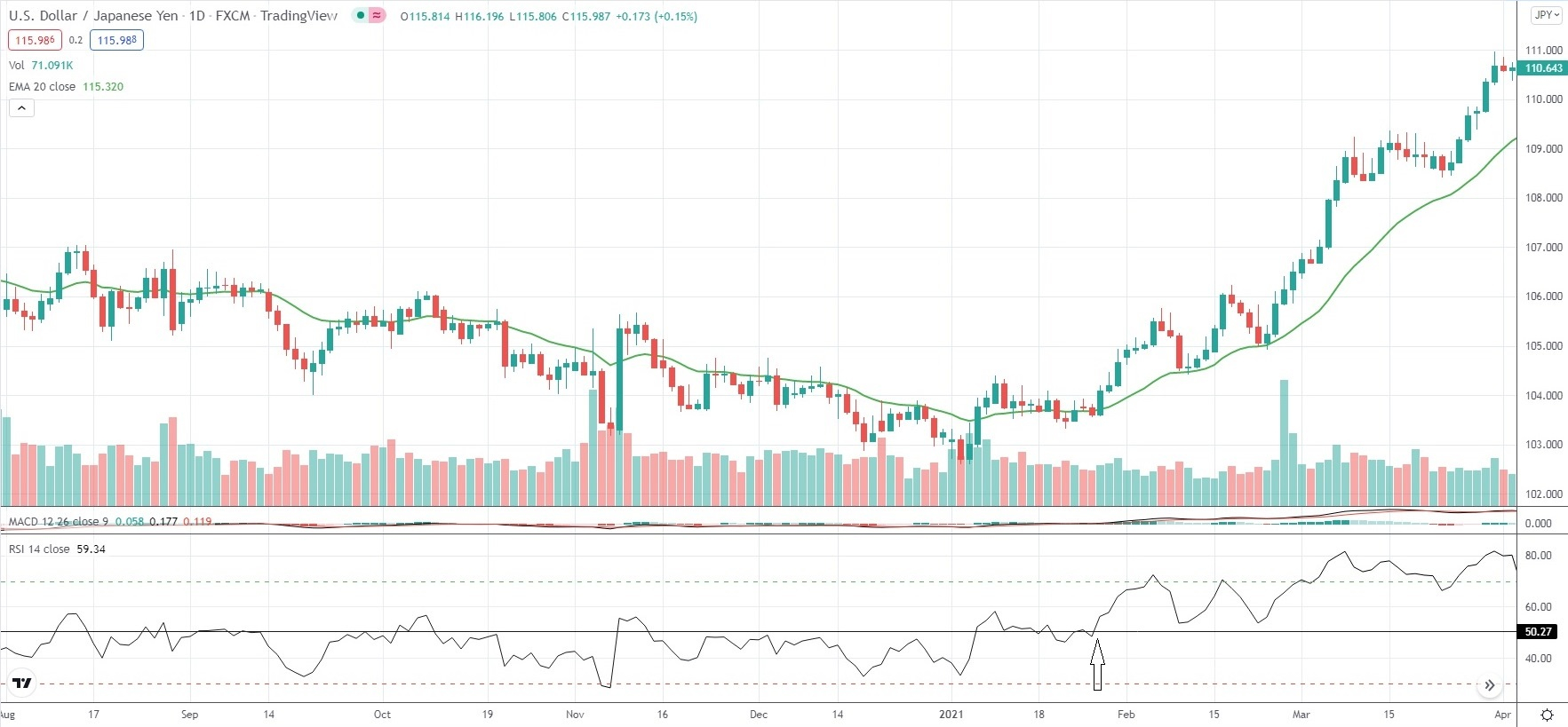
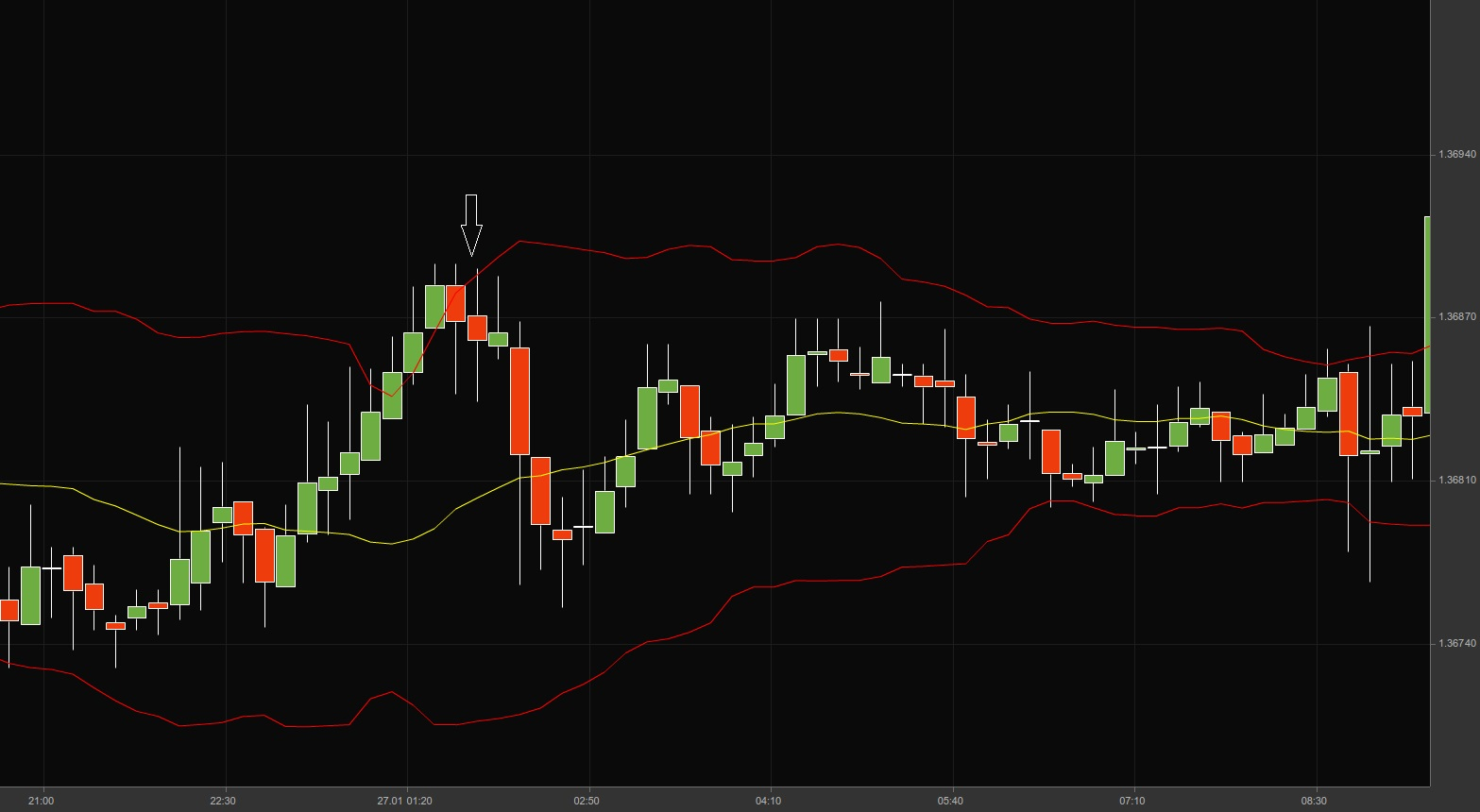
There are other confirmation methods as well. A trader may establish a breakout zone with a specific percentage beyond the level of breakout. If the price successfully penetrates the breakout level and the breakout zone beyond it, then this could be an actual breakout. Traders may use any percentage as a signal. Most commonly (in stock trading practice), they will use the 3% rule – a point that stands 3% beyond the breakout level.
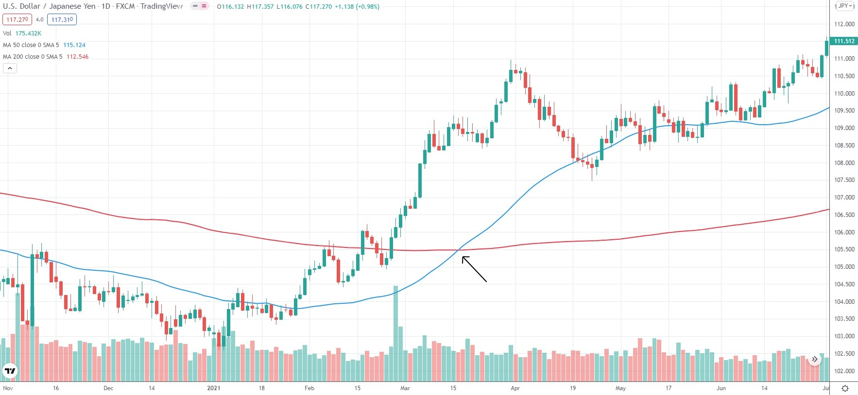
On the 1-hour chart of USD/JPY below, we use a 0.30% filter from the breakout level.
Retracements (corrections to the principal trend)
A retracement (correction) is a temporary reversal in price direction that occurs against the principal trend. A retracement differs from a reversal. Retracements are short-term corrections to the underlying long-term trend, while reversals indicate the end of the principal trend and the start of a new trend.
In a significant bull trend, а price increase is periodically interrupted by bearish corrections. The latter usually begin at a resistance point and end at a support point. Retracements are smaller trends themselves and run in the opposite direction to the main trend.
In a significant bull trend, it is logical to expect that retracements will be short and will not correct a large percentage of the previous rise. In case a bull trend appears to be strong, retracements will usually not exceed 50% of the prior rise. The same principle is valid for bear trends.
In a bull trend, if a retracement extends its decline to over 50%, the trend line in the long-term trend will no longer be relevant. Thus, the size of retracements indicates how strong the longer-term trend is.
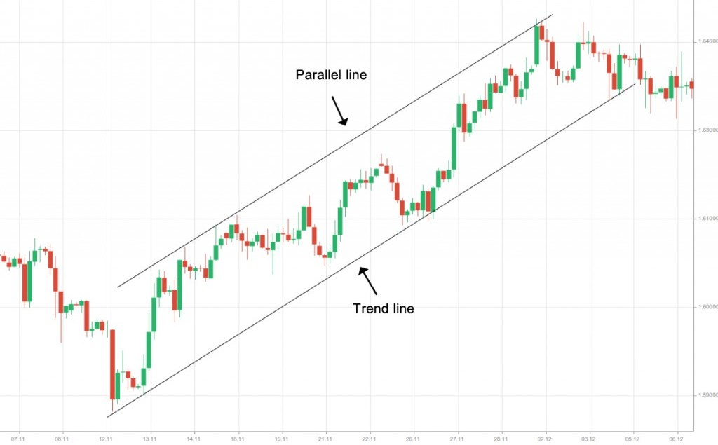
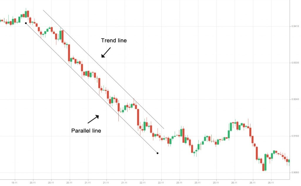
Channels
Channels represent trading ranges defined by a trend line and a concurrent line drawn through price peaks and troughs. Three types of channels can be formed, depending on price direction – ascending channels, descending channels, and sideways channels.
Ascending channels represent upward-sloped trading ranges, where the price registers higher highs and higher lows at an almost equal pace.
To form an ascending channel, traders need to follow a few simple steps:
- First, place a trend line as discussed earlier in the guide;
- Second, place another line with the same angle and adjust its length according to the channel projection;
- Third, drag the concurrent line and plot it so it can run through the nearest high;
- Fourth, if we have a real ascending channel, all the prior highs will lie on the concurrent line (or deviate from it very slightly);
- Fifth, you should not try to forcefully make the second (clone) line appear parallel to the trend line. In case of a mismatch, there simply is no channel.
Descending channels represent downward-sloped trading ranges, where the price registers lower highs and lower lows at an almost equal pace.
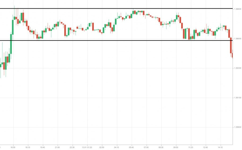
Horizontal channels represent trading ranges with no difference in the angle between peaks and troughs – the price moves between horizontal support and resistance levels.
Pivot levels and how they are used
The Pivot levels (pivot points) represent a technique used by day traders to determine the most probable levels of support and resistance. They can also be used to confirm breakouts from ranges.
Every tradable instrument registers four key price levels every single trading day – an open price, a high price, a low price, and a close price. These levels are sufficient to calculate the Pivot points.

The reason why many traders use this technique is that Pivot levels have a predictive nature and specify potential turning points for the current session. And since the market tends to react at those levels, traders can use them to open positions. The calculation formula can be presented as follows:
Pivot Point = (High + Close + Low)/3
Once you know the Pivot Point (PP), you can easily calculate the resistance and support levels:
Resistance 1 = (2 * PP) – Low
Support 1 = (2 * Pivot) – HighResistance 2 = PP + (High – Low)
Support 2 = PP – (High – Low)Resistance 3 = High + 2*(PP – Low)
Support 3 = Low – 2*(High – PP)
If you take the high, low, and closing prices of a given instrument during the previous trading day, you can calculate 7 points of interest for the current day – an actual pivot point, three levels of support, and three levels of resistance.
If the market opens above the Pivot level, then the current session’s bias is very likely to be for long (buy) trades as long as the trading instrument holds above the Pivot point. If the market opens below the Pivot level, then the current session’s bias is very likely to be for short (sell) trades as long as the trading instrument holds below the Pivot point.
Traders may expect a reversal or a break of the R1 or S1 levels. When the price reaches R2 and R3 or S2 and S3 levels, the asset will already be overbought or oversold. Therefore, traders will usually use those levels to exit their positions, not to enter ones.
One of the most favorable scenarios would be if the open price is above the actual pivot level, then the market stalls at R1 and continues up towards R2. In this case, traders may prefer to open a position on a break above R1 and set a profit target at R2. If the market indeed reaches R2, traders may exit half of their position at that level. After that, they may target R3, at which level they may close the remaining part of the trade.
The key advantage of the Pivot level technique is that the same calculations based on the same formula are used by many market players. On the other hand, drawing support and resistance levels as well as trend lines on the price chart can be quite subjective.
Simple Moving Average (SMA)
Moving averages are valuable indicators that smooth day-to-day price fluctuations, thus, enabling technicians to view the underlying trend without distractions by small (day-to-day) moves.
A rising MA usually indicates a bull trend is in play while a decreasing MA indicates a bear trend. Some technicians have adopted a certain approach when relating MAs to a market trend. If a trading instrument closes above a Simple Moving Average, then it may be moving in a bull trend. If the trading instrument closes below a Simple Moving Average, then it may be moving in a bear trend.
Yet, selecting an MA period (length) to estimate a market trend depends on the analyst’s personal preferences. The SMA’s period (length) will usually depend on one’s trading style and preferred time frame for trading. Consequently, setting a suitable SMA period (length) is achieved through experimentation and experience.
Although SMAs provide help to identify a market trend, they only do so once the trend has commenced. Or, we can say that MAs are lagging indicators because they are based on historical prices.
Moving averages can be of different lengths. The most popular daily MAs are for periods such as 10, 20, 30, 50, 80, and 200 days. The 10-day SMA represents nearly two weeks, the 20-day SMA represents one month, and the 80-day SMA represents four months of trading data.
MAs with greater length will usually pick up changes in a market trend more slowly. However, there is a lower probability that those MAs provide a false signal of a trend change, as they represent a larger number of data observations. The more information included in the SMA’s calculation, the less important every day’s data will be in the calculation itself. A huge change in data value from a single day is not likely to affect the longer-term Simple Moving Average.
Exponential Moving Average (EMA)
Simple Moving Averages have faced criticism mostly due to their ”drop-off effect.” If the latest price shows almost no change, while the oldest price data (being dropped off) shows considerable change, the MA will surely be affected by the omission of the earlier data. SMAs completely disregard the older data, with the latter remaining outside of the MAs’ length. To keep the older data in the MAs’ calculation, technical analysts will use an Exponential Moving Average (EMA).
In the SMA’s calculation for a particular number of trading days, every day is equally important (equally weighed). This means the data for each day will have an equal effect on the SMA’s value. The EMA will assign different weights, depending on data recentness. The latest data is assigned greater importance (greater weight) and the oldest data – is of lesser importance (lesser weight).
The chart above visualizes a 10-day SMA (black) and a 10-day EMA (blue). The EMA tends to change its direction faster than the SMA due to the additional weighting it assigns to the latest data. We can see on the chart that during the last four days, the EMA moves below the SMA. It is so, as the market demonstrates a clear downtrend during the last 4 days. Thus, the EMA visualizes the latest sentiment more clearly. In the first 12 days (12 successive green candles on the left) the Exponential Moving Average holds above the Simple Moving Average and reacts more swiftly to the change in sentiment (the 8 successive red candles that follow). Consequently, the EMA better reflects market participants’ actions than the SMA.
Moving Average Crossovers
Technicians typically do not base their trading decisions on moving averages alone; instead, they wait for the strongest signal that moving averages can produce. That is known as moving average crossover. It can be observed when a short-term MA moves through a long-term MA. Crossovers indicate that a significant move is about to occur, since momentum shifts in one direction.
A bearish (sell) signal is produced when the short-term MA crosses the long-term MA from above to the downside. A bullish (buy) signal is generated when the short-term MA crosses the long-term MA from below to the upside.
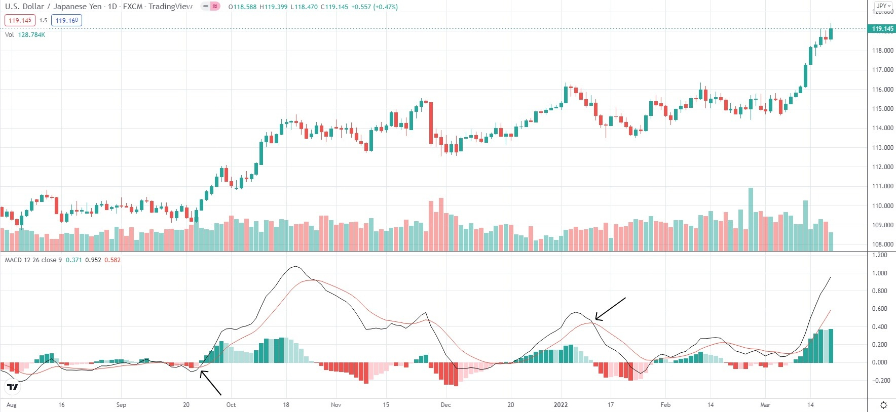
The “Golden Cross” is an occurrence that signifies a huge shift in sentiment when bulls dominate the market. This cross can be observed when a medium-term MA (50-day MA) breaks above a long-term MA (200-day MA).
The “Death Cross” is another occurrence that signifies a major shift in sentiment when bears dominate the market. This cross can be observed when a medium-term MA (50-day MA) moves below a long-term MA (200-day MA).
As soon as the 200-day average is penetrated, it will act as a key resistance level (in a Death Cross condition) and as a key support level (in a Golden Cross condition). Price action may often be trapped between the medium-term and the long-term MAs and this provides good swing trading opportunities.
MA crossovers are often used as a confirmation tool in a range of trading strategies. But still, we should again note that MAs are trending indicators and reflect directional momentum. All MAs tend to be less effective within continuous trading ranges, as averages converge in a single price level eventually. In times when price action is particularly thin (presented almost as a flat line), MAs tend to provide little or no clues over price direction.
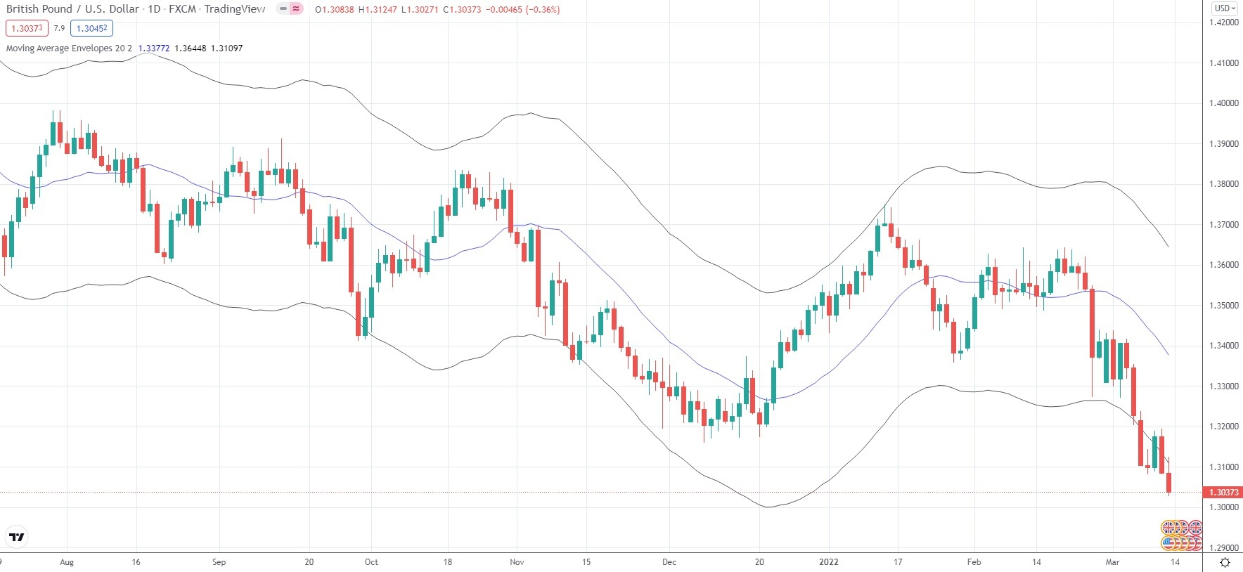
Moving Average Envelopes
Envelopes represent two boundaries plotted at a particular distance above and below a moving average. If the price deviates too much from that moving average and hits one of the two boundaries, this usually suggests market movement has been overextended. Such spikes may trigger price corrections because overextended moves are not sustainable.
Short-term MAs (20-day MA, for example) will be surrounded by a 3% envelope or even smaller. Medium-term and long-term MAs will usually be surrounded by a 5% envelope or larger.
Relative Strength Index (RSI)
The RSI is an oscillator that displays overbought or oversold market conditions, as it compares the scale of a trading instrument’s recent gains to its recent losses.
The RSI can be used to generate entry and exit signals by identifying the possible end of a trend or the beginning of a new one. This oscillator weighs the upward versus the downward momentum of a given instrument over a particular period (by default 14 periods). Or, it displays whether the instrument has moved unsustainably high or low.

The RSI moves within a range of 1 to 100, whereas the 50.0 level is a notable point that distinguishes a bull from a bear trend. Two other levels to watch include the 30.0 and 70.0. RSI readings below 30.0 indicate oversold market conditions, while readings above 70.0 indicate overbought conditions. Those two levels are not necessarily preset and can be modified manually at any time in accordance with a trader’s strategy.
If the RSI reading is above the 50.0 level, it indicates that there are more buyers than sellers, leading to an upward price movement. If the RSI reading moves below the 50.0 level, this suggests there are more sellers than buyers, leading to a downward price movement.
The RSI should be used as a trend-confirmation tool. In case you have concluded a new trend may be forming, check the RSI reading so that you are more convinced of the current market situation. If you believe an uptrend is forming, an RSI reading above 50.0 will provide you with a confirmation of that.
Yet, traders will usually pay close attention to the moment when the RSI approaches its overbought and oversold zones. Overbought conditions indicate a high possibility there are not enough buyers in the market to drive the price further up. As a result, upward movement will stall. Oversold conditions indicate a high possibility there are not enough sellers in the market to drive the price further down. As a result, downward movement will stall.
When the RSI reaches the area near its overbought level (70), it is quite likely that upward price movement will slow down and even reverse to the downside.
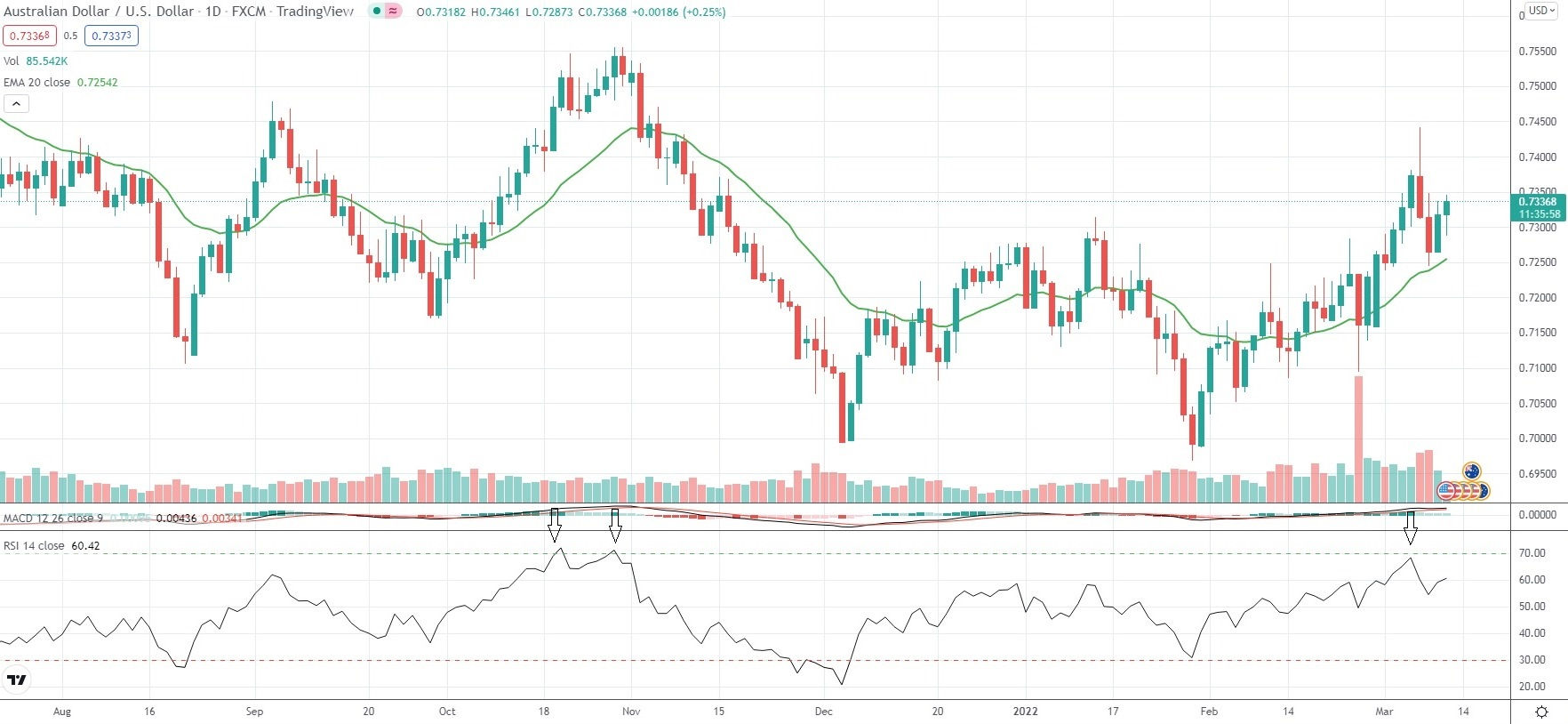
When the RSI reaches the area near its oversold level (30), it is quite likely that downward price movement will slow down and even reverse to the upside.
We can say that overbought/oversold levels tend to act as areas of support/resistance.
Standard Deviation Technical Indicator
The Standard Deviation indicator reflects how sizeable the recent price movement in a given trading instrument has been and it is used to forecast price volatility in the future. Way too high standard deviation readings suggest the trading instrument has recently moved considerably, but its volatility could soon diminish. Way too low standard deviation readings suggest the opposite.
The indicator actually reflects the size of price deviation from the moving average. In case the standard deviation appears very low, or the market has shown subdued activity, a trader could expect a surge in activity to occur soon. And, in case the standard deviation appears extremely high, one could anticipate market activity to decrease soon enough.
Most commonly, the standard deviation indicator is used by traders to forecast price reversals based on “reversion to the mean”. This principle assumes every deviation from the mean should be followed by a reversion to that same level so that the overall price distribution matches the standard distribution.
This indicator tends to be a good choice for technical analysts within a trending market environment, where moderate volatility is observed and price oscillation is clustered around the midpoint of the range.
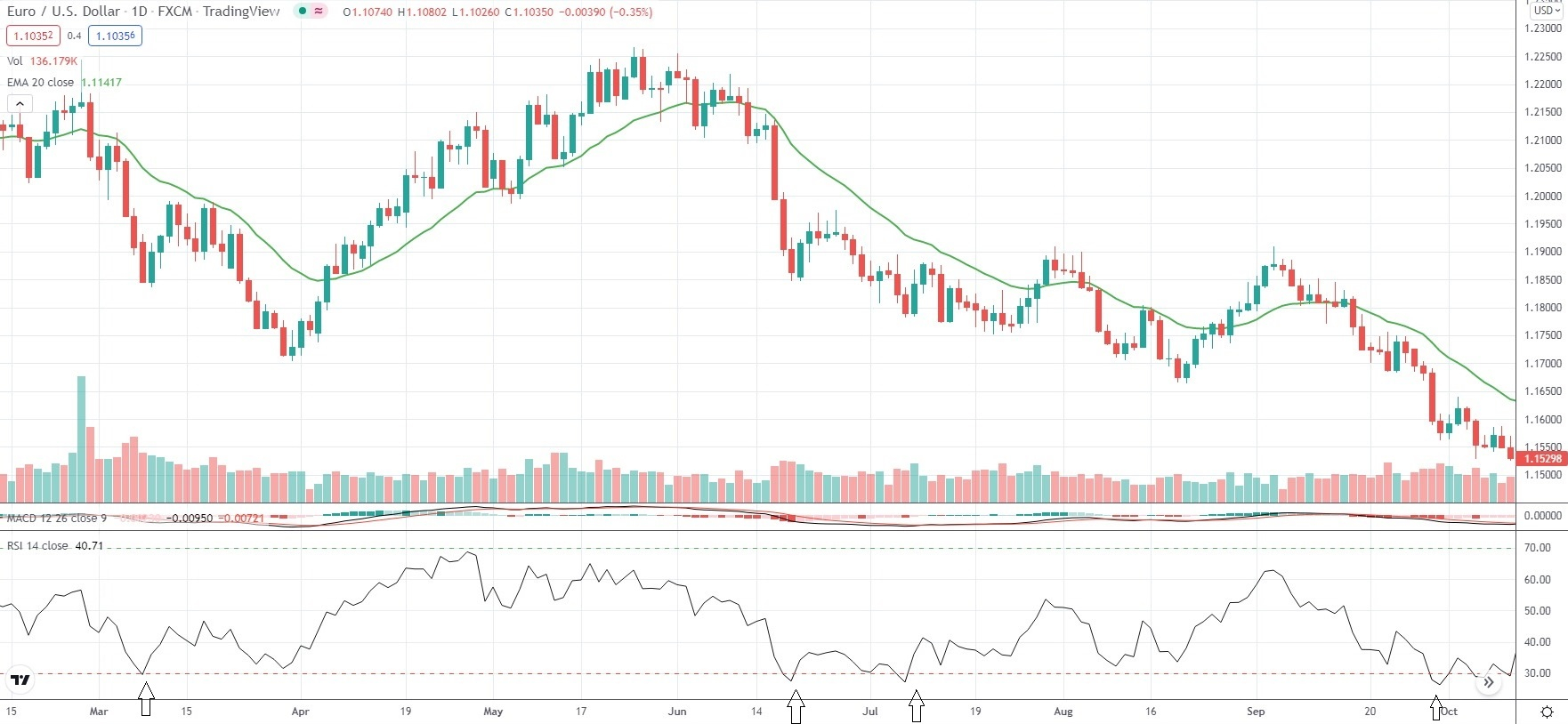
Let us consider a simple example. In case the EUR/USD pair is trading within the 1.1000-1.2000 range for a considerable period and the majority of movement is concentrated in the middle of that range, you could place a trade by assuming reversion to the mean based on standard distribution.
But if we have the opposite scenario – the price movement is concentrated near the edges of the 1.1000-1.2000 range (say between 1.1000-1.1100, or between 1.1900-1.2000), then it is quite possible that price distribution may not be standard. Therefore, the standard deviation indicator may not be an appropriate option to base your trading decisions on.
Moving Average Convergence Divergence (MACD)
The MACD is an indicator that helps traders determine price direction, possible trend reversals, and the strength of the particular movement. The MACD reflects the difference between the 12-period EMA and the 26-period EMA for a given tradable instrument. Both EMAs are calculated by using the close prices for the respective period. A third, 9-period EMA will also be visualized and its purpose is to signal long and short market entries.
A buy signal is generated when the MACD moves above its 9-period EMA. A sell signal is generated when the MACD moves below its 9-period EMA.
The MACD histogram best visualizes the difference between the MACD and its 9-period EMA. The histogram will remain positive when the MACD is above its 9-period EMA. And conversely, the histogram will remain negative when the MACD is below its 9-period EMA.
During an uptrend, the histogram will expand if the pace of price action picks up and it will contract if the pace of price action slows down. During a downtrend, the same principle works oppositely. In other words, many traders use the MACD in order to gauge momentum.
Other traders may use the MACD histogram to detect occurrences known as divergences. They will examine the chart for points where the price registers a new swing high (or a new swing low), but the MACD histogram does not. In other words, it signals that a divergence between price and momentum has occurred.
Bollinger Bands
Bollinger Bands belong to the group of oscillating indicators that gauge market volatility. Traders employ Bollinger Bands to forecast if the price of a given asset may reverse after reaching relatively low or high levels compared to its recent average. Bollinger Bands are comprised of the following elements:
- an upper band that indicates if the instrument has become overbought;
- a lower band that signifies if the instrument has become oversold;
- a middle band that is usually the instrument’s 20-period Simple Moving Average.
When the price nears the upper band, the trading instrument becomes overbought, as it is priced relatively high compared to its recent average. A bearish signal is generated, while the price is expected to return to the moving average. As a result, traders will usually exit their long positions and place short trades.
When the price nears the lower band, the trading instrument becomes oversold, as it is priced relatively low compared to its recent average. A bullish signal is generated, while the price is expected to rebound and return to the moving average. As a result, traders will usually exit their short positions and place long trades.
Still, traders may not place orders based only on Bollinger Bands signaling overbought or oversold conditions. If the price has hit the lower or the upper band, it would not necessarily mean a reversal will take place. They will need further confirmation by looking into candlestick patterns or by using some other technical indicator.
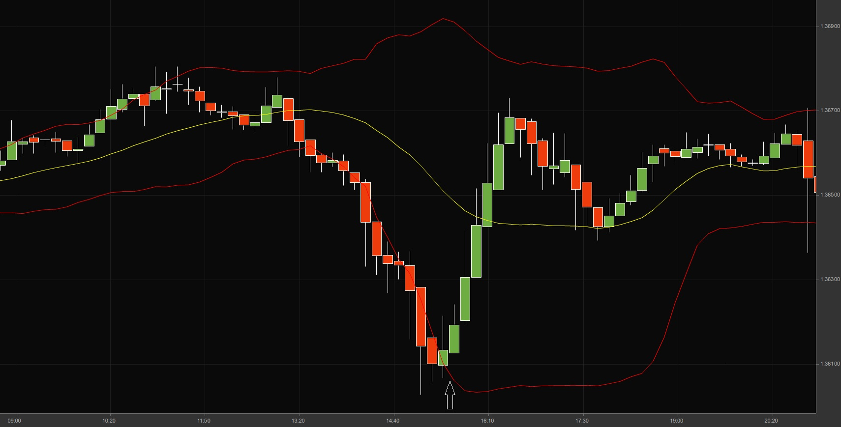
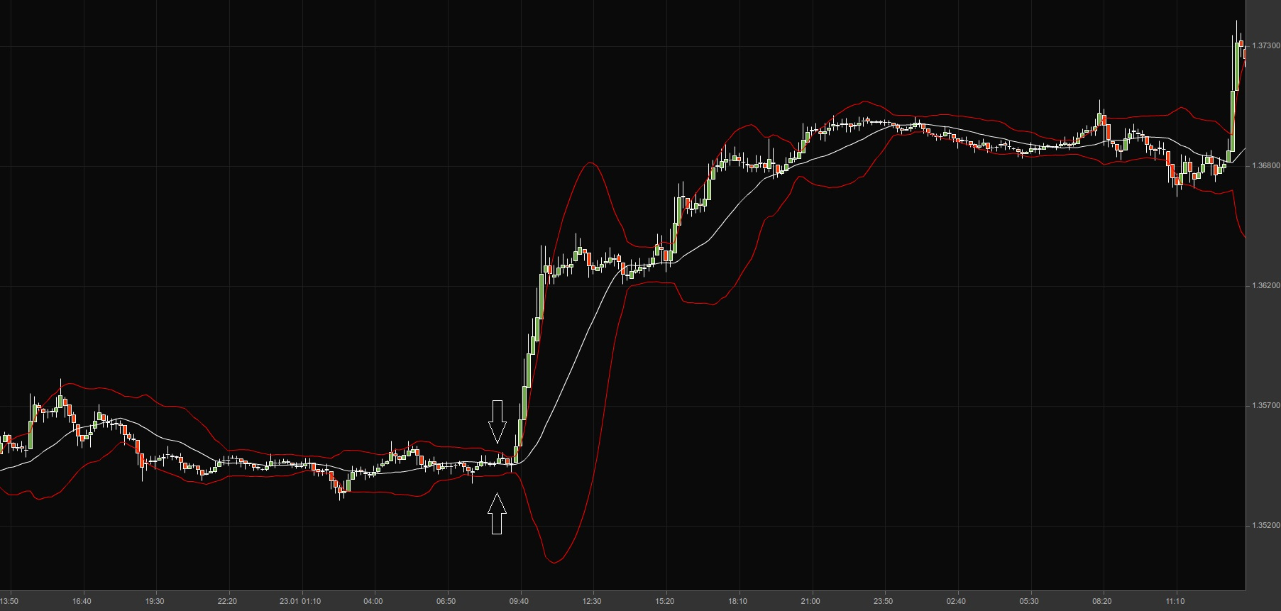
At times, the distance between the bands will narrow. This occurrence is known as a “Bollinger squeeze” and it often indicates a breakout is about to take place. In case the price breaks out above the upper band, the move to the upside will likely continue. In case the price breaks out below the lower band, the downward move will likely continue.
The chart below visualizes a “Bollinger squeeze”, followed by a breakout to the upside.
Double Top, Double Bottom
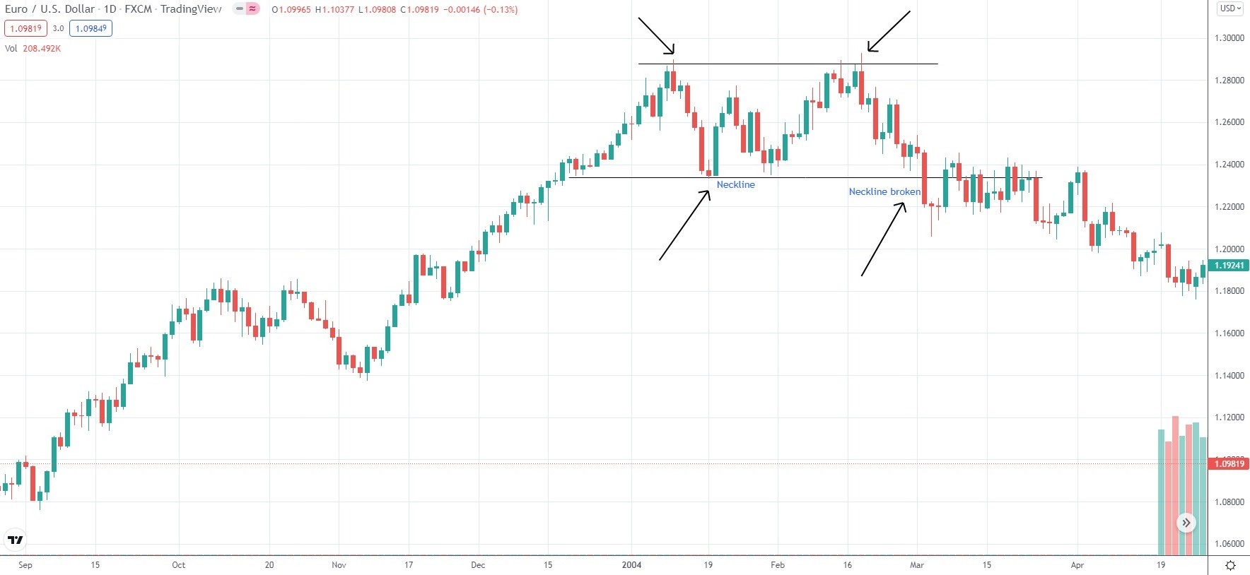
The Double Top is an M-shaped bearish reversal pattern, which forms after the market has been moving in an uptrend. It provides a trader with the opportunity to go short. Price action will reach two peaks separated by a trough. A “neckline” will also be formed, at the bottom part of the Double Top formation.
A real Double Top will have the following key features:
- the initial price will enter the pattern from below the trough price level, while the exit will be on the breakout below the neckline;
- the two peaks will usually be identical or within 5% of their price level;
- the formation will be confirmed when the market closes below the low price of the bottom part;
- the formation will fail when the market closes above the second peak;
- the pattern will form in a period of 2 to 7 weeks. The longer the period of the formation, the less reliable it will be.
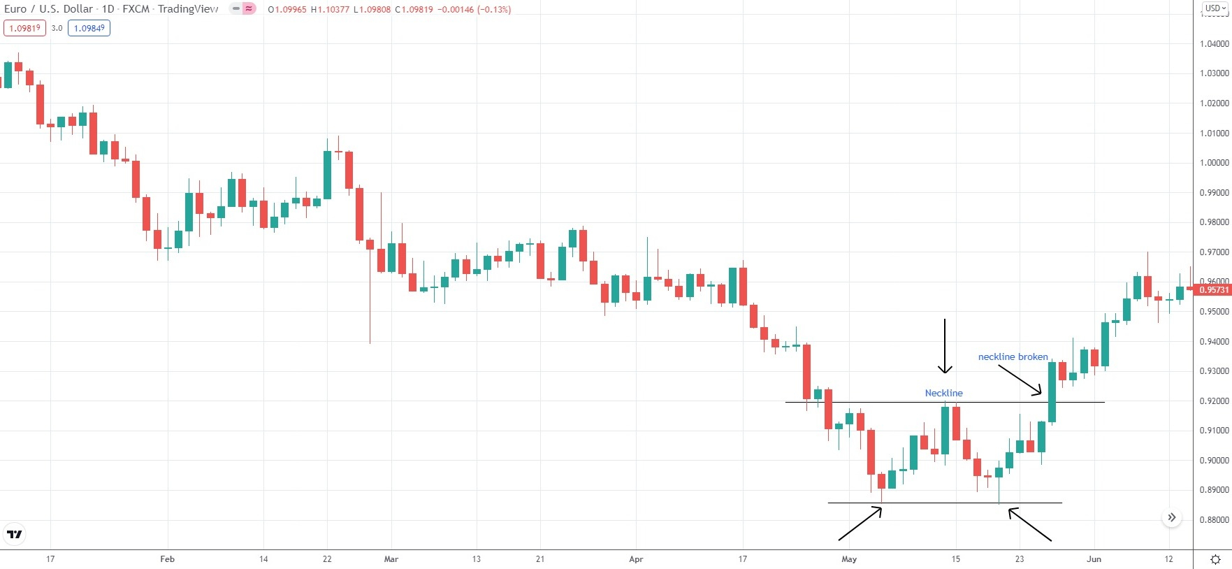
The Double Bottom is a W-shaped bullish reversal pattern, which forms after the market has been moving in a downtrend. It provides a trader with the opportunity to go long. Price action will reach two troughs separated by a peak. A “neckline” will again be formed, at the top part of the Double Bottom formation.
A real Double Bottom will have the following key features:
- the initial price will enter the pattern from above the peak price level, while the exit will be on the breakout above the neckline;
- the two troughs will usually be identical or within 5% of their price level;
- the formation will be confirmed when the market closes above the high price of the top part;
- the formation will fail when the market closes below the second trough;
- the pattern will form in a period of 2 to 7 weeks. The longer the period of the formation, the less reliable it will be.
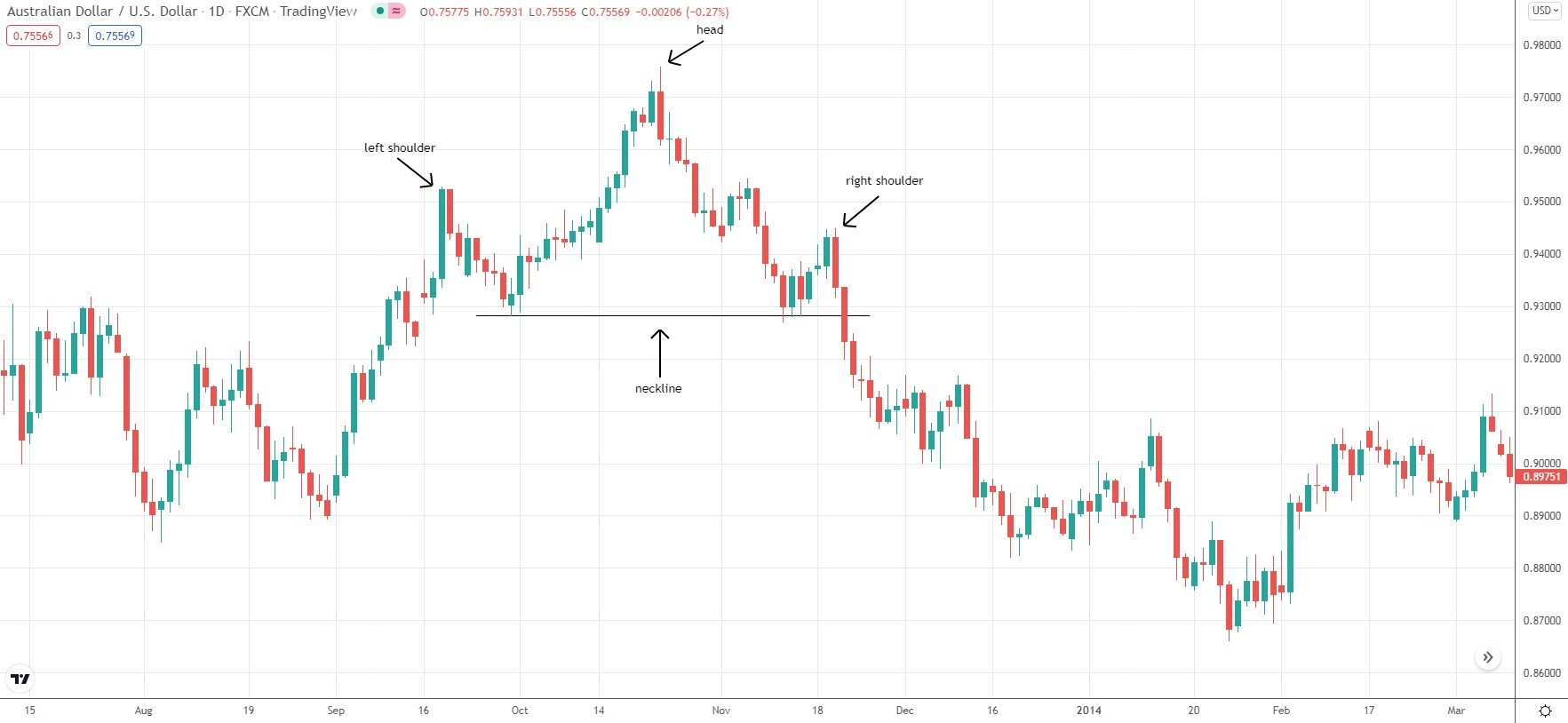
Head and Shoulders
This price pattern usually appears after a bull trend and, if confirmed, it triggers a trend reversal. There is another pattern, known as Inverse Head and Shoulders, which appears after a bear trend and, if confirmed, indicates the end of the move to the downside.
The Head and Shoulders formation features three highs (peaks) – a left shoulder, a head, and a right shoulder. The head is usually the highest peak, while the two shoulders usually appear of relatively equal height.
As the price moves up, the left shoulder of the future pattern forms as a high (which is actually the peak of the current trend).
To form a shoulder, the price then has to retrace down, falling to a trough (low). That low may be above or at the trend line. In other words, it will still keep the bull trend in force. That low is the first point to determine the location of the pattern’s neckline.
After that, a new higher high will begin forming, up from the trough of the left shoulder. That new high is the head of the pattern. After the head is formed, the price then retraces down and this is usually the point where the bullish trend line is penetrated – this signals momentum has shifted.
The second trough, formed after the price drops from the head’s high, is the other key point to establish the neckline.
The next rebound from the second trough will form the third high (right shoulder). It will usually be lower than the second high (head) and will roughly match the height of the left shoulder.
The entire formation will usually be confirmed when the slide from the third high (right shoulder) penetrates the neckline and at least one candle closes below it.
The neckline of the pattern should be horizontal, but most frequently it will slope up or slope down. Note that a downward-sloping neckline may be considered more bearish compared to an upward-sloping neckline.
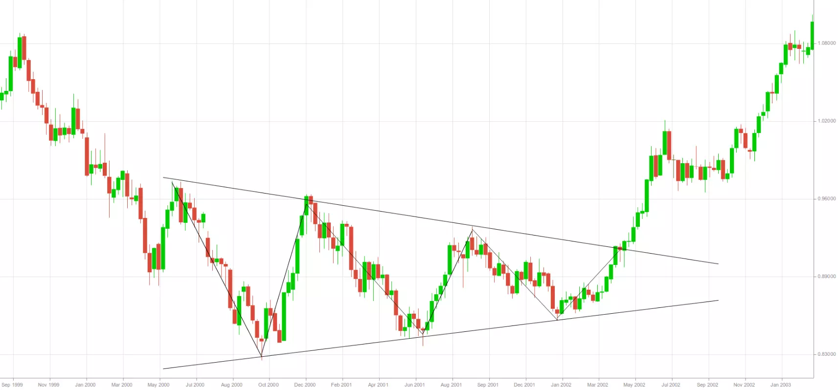
Triangles
Sometimes a price pattern may have boundary lines that are not parallel. If those lines are extended in the future, they will eventually cross and form a pattern known as a triangle. Three main types of triangles can be discerned – symmetrical, ascending, and descending.
Symmetrical triangles are formations that have a lower boundary with an upward slope and an upper boundary with a downward slope, thus, they have a horizontal direction. Within the formation, the price registers lower highs and higher lows at a nearly equal pace. Both boundary lines tend to have the same angle, but directions differ. Price action usually fills the triangle’s area and the price has to touch every boundary line at least two times.
Symmetrical triangles are typically considered trend continuation formations, indicating a temporary pause or consolidation, rather than reversal formations. Within those patterns, bulls and bears are unable to prevail over each other, until at some point most traders become aware of a particular direction. When this happens, a breakout from the triangle will take place.
On the chart below we can see a symmetrical triangle with a breakout occurring to the upside.
Ascending triangles are formations that have a lower boundary with an upward slope and a horizontal upper boundary (resistance line). Within the formation, the price registers higher lows, while the resistance line restrains price action until a breakout takes place. These triangles indicate that bulls are strong since the price registers higher lows. The strength of the bears, on the other hand, is gradually decreasing. Although sellers can force buyers away from the resistance line, every time it happens with a diminishing force.
Sellers do not manage to push buyers back to the same lows and eventually buying pressure rises as more bulls join in. As a result, the price begins to approach the resistance line until it finally breaches above it. In most cases, the breakout is in the direction of the triangle (upward breakout), but still, it can occur in the opposite direction as well.
On the chart below we can see an ascending triangle with a breakout occurring to the downside.
Descending triangles are formations that have an upper boundary with a downward slope and a horizontal lower boundary (support line). Within the formation, the price registers lower highs, while the support line restrains price action until a breakout takes place. These triangles indicate that bears are strong, since the price registers lower highs. The strength of bulls, on the other hand, is gradually decreasing. Although buyers can force sellers away from the support line, every time it happens with a diminishing force.
Buyers do not manage to push sellers back to the same highs and eventually selling pressure rises as more bears open positions. As a result, the price begins to approach the support line until it finally breaches below it. In most cases, the breakout is in the direction of the triangle (downward breakout), but still, it can occur in the opposite direction as well.
On the chart below we can see a descending triangle with a breakout occurring to the upside.
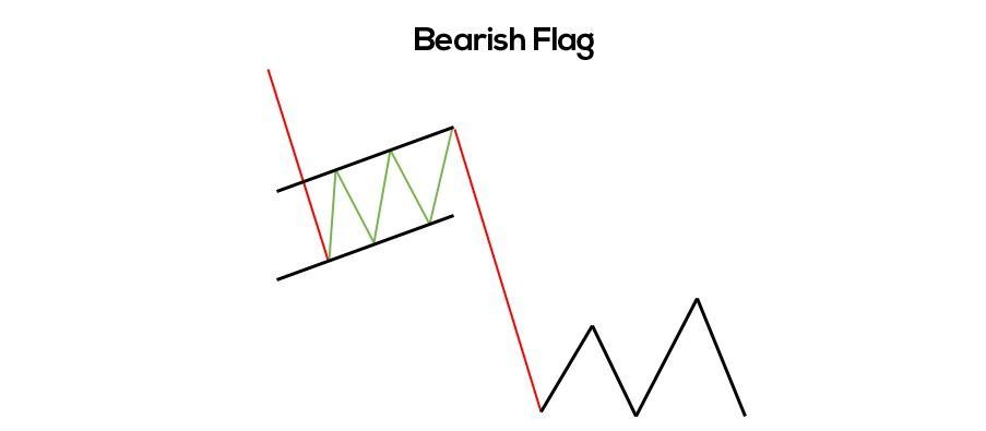
Flags and Pennants
Flags and pennants represent short-term continuation patterns that occur frequently. Their appearance may resemble that of wedges, rectangles, and triangles, but their size is usually much smaller.
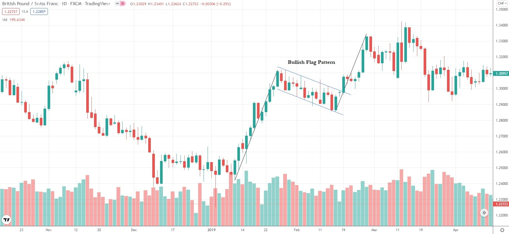
Flags are short channels with slopes in the opposite direction to that of the preceding trend (they are very often preceded by a steep price move). These price patterns tend to form over short periods (several days to several weeks). While flags form, a decrease in volume can usually be observed.
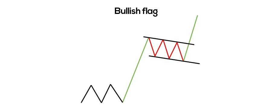
The daily chart below visualizes a bullish flag pattern.
Pennants are quite similar to flags, with the main difference between the two formations being that pennants’ trend lines eventually converge and form a small triangle. Similar to flags, the pennants’ slope is in the opposite direction to that of the preceding trend. As pennants form, a decrease in volume can usually be observed, while on the breakout after the pattern’s formation volume will increase.
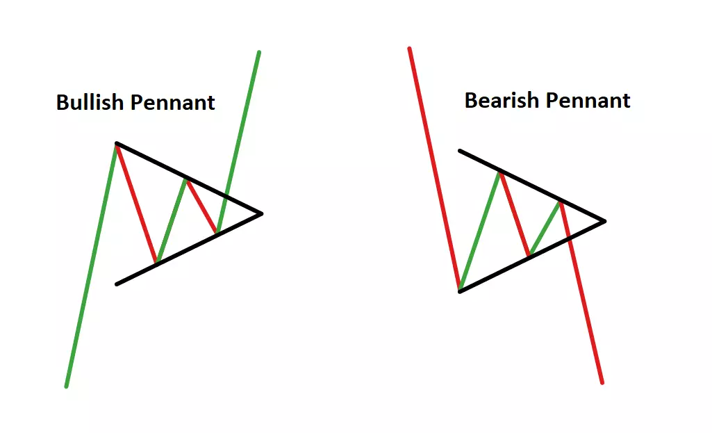
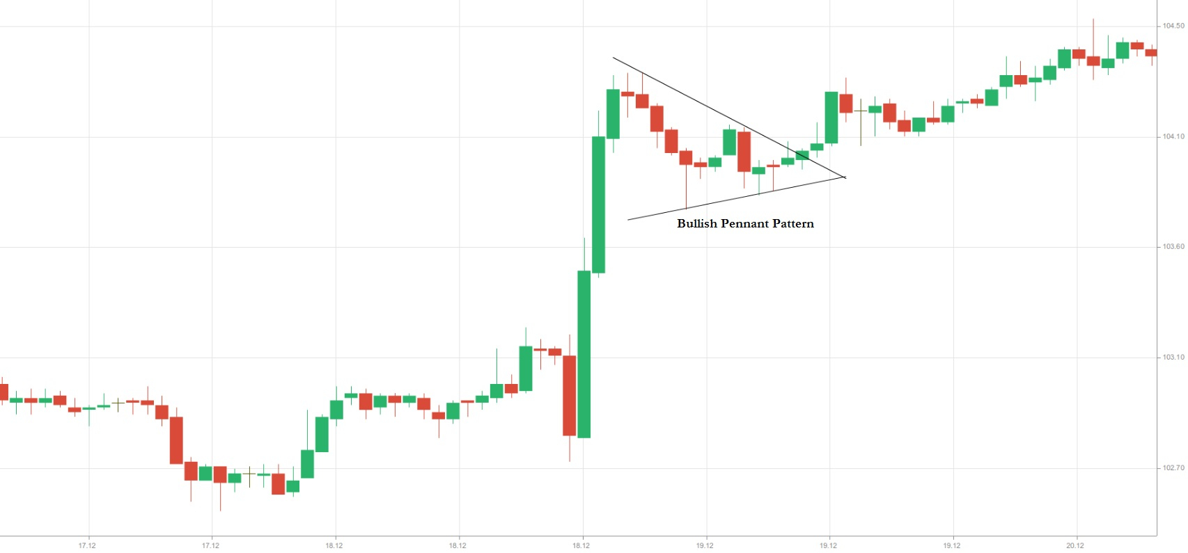
To identify flags and pennants, traders need to look for a steep trend that precedes those patterns. Many traders will prefer to wait for the complete formation to appear before making an entry. This usually happens on the breakout that follows the patterns. A valid breakout will usually be in the same direction as that of the preceding trend.
A trader may open a long position, when the price penetrates the upper trend line (resistance), while a Stop-Loss may be placed below the lower trend line (support). A trader may open a short position, when the price penetrates the lower trend line (support), while a Stop-Loss may be placed above the upper trend line (resistance).
Rectangles
A rectangle formation will appear on the chart when the price has been moving between two horizontal lines – the upper line being a resistance and the lower line being a support. These two boundaries also have to be trend lines, or the price must touch them both at least two times. The price will fluctuate between the two parallel lines and at some point a breakout will occur in one direction or the other.
The price may not always touch the two parallel lines within a rectangle. It may, instead, register ”shortfalls”.
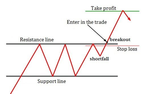
There may often be “false breakouts” from rectangles. Those occurrences will not provide hints at the direction of a real breakout. False breakouts are minor breakouts, which occur below or above breakout levels and then they go back inside the rectangle. They will occur in the opposite direction to that of the actual breakout.
Rectangles may trigger price reversals, but they can also indicate trend continuation. As trend reversal patterns, they will occur frequently at bottoms. As trend continuation patterns, they can be bullish or bearish rectangles.
A bullish rectangle is formed when the price has been moving in an uptrend before the pattern appears. The price consolidation can be observed inside the rectangle for a particular period, after which the bull trend continues.
A bearish rectangle is formed when the price has been moving in a downtrend before the pattern appears. The price consolidation can be observed inside the rectangle for a particular period, after which the bear trend continues.
Conclusion
The beauty of technical analysis lies in its versatility. A trader does not need a degree in Economics to examine a price chart effectively. The markets being traded can also vary – Foreign Exchange, Stocks, Crypto, Commodities, etc. The technical principles of trend, trading range, support, resistance, and other aspects of technical analysis can be applied to any chart. Still, employing technical analysis is not an easy approach and if one is to achieve success, they will have to study its various aspects, dedicate time to develop a strategy and test it and, last but not least, stay open-minded for evolving markets.